
Fritz Fryer Lighting
case study

I began this project by meeting with the team in their beautiful showroom in Ross on Wye. They had recently undergone a rebrand and asked me if I could help interpret their new brand image into a stand design that would ‘Wow” and be the perfect launchpad for their new contemporary lighting range. This was the first time they had exhibited at 100% design and budget restraints meant a completely bespoke ‘design and build’ was out of the question. I needed to take a generic stand design and add character and the ‘feel’ they wanted to reflect their new brand message.
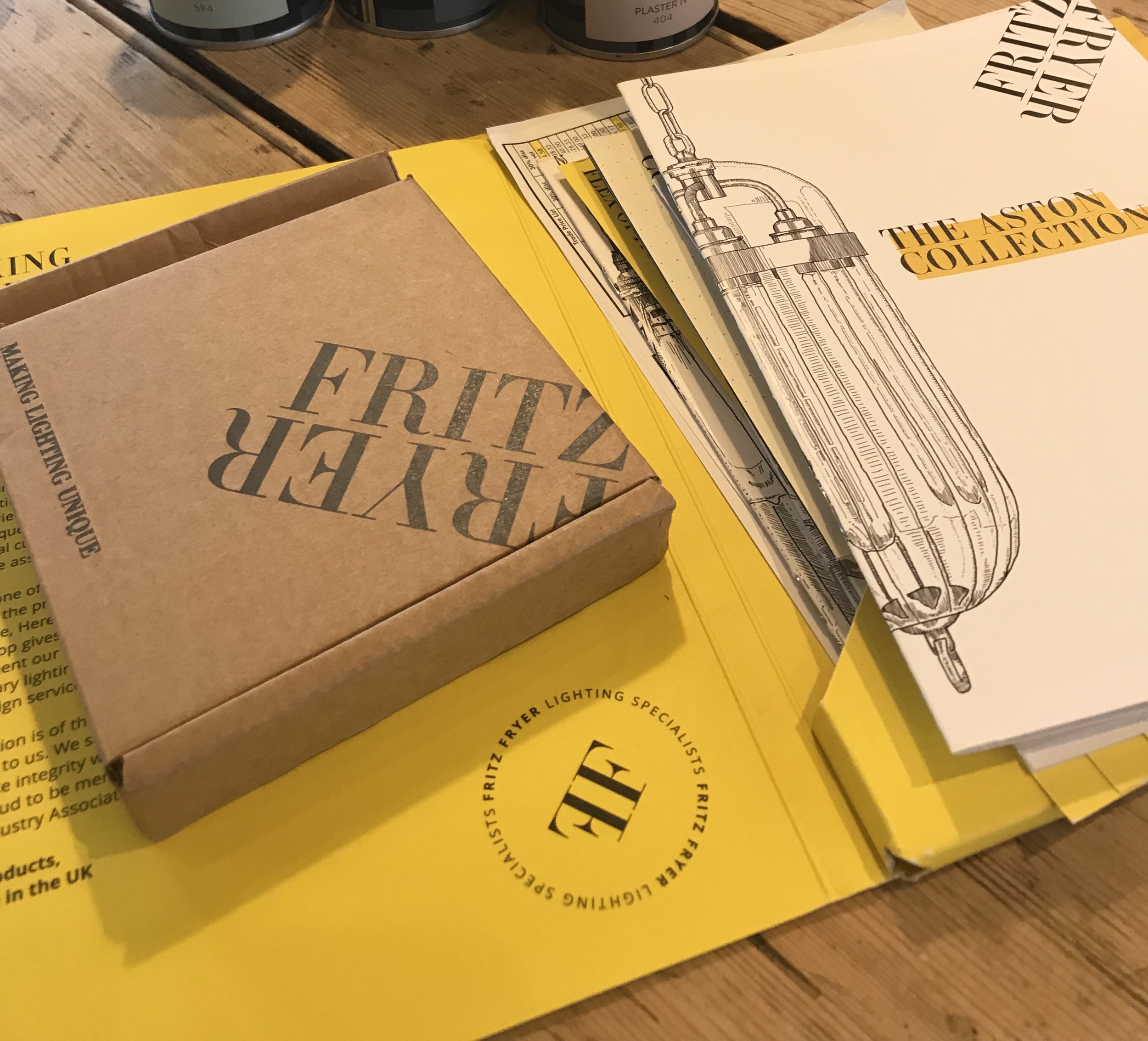
They already had their brand colours and logos in place so that was where I started. We initially discussed introducing different design elements such as wall panelling, but taking into consideration their limited budget, felt that we could create the character and quality they wanted by clever use of colour, dramatic lighting displays and also implementing the beautiful handrawn illustrations that were part of their branding already.
Design Process
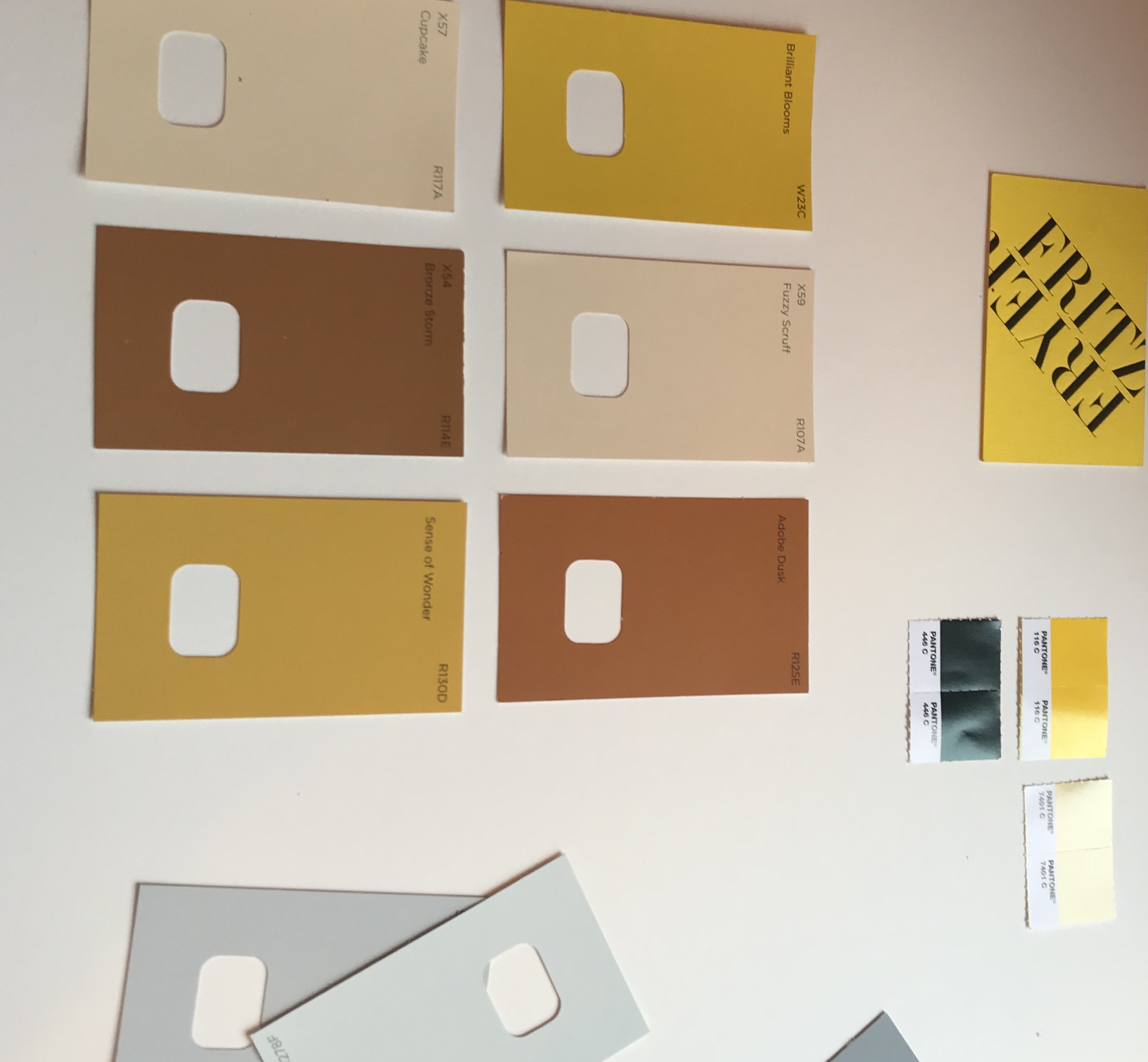
The first thing I do after meeting a client is to quickly sketch out initial ideas - my instinctive thoughts. I usually find these ideas are useful to refer back to if I go off track during the design process. The next stage was to take their brand colours and translate them into paint colours. From the array of different colours that were part of their overall brand package I decided that the yellow and very dark grey had to be part of the concept but I also wanted to add a new colour as this would provide some calm and cool in contrast to the ‘heat’ of the yellow and of course all the lights. It was also apparent that the yellow and grey needed to be warmed up a little as we were creating a warm, inviting space that people would enjoy and want to be part of.


I always produce artists impressions and drawings for my clients. They are really to show the concept of the design and they also give me a chance to see how the colour works in the space. I find I work more instinctively when I produce drawings as its like creating a painting. You put down the base colours and then build the layers to create a cohesive, harmonious scheme. It also gives me the opportunity to see how the space works in relation to the product and display elements. Most importantly it gives the client a clear vision of the stand design concept - vital when you are introducing a ‘new’ colour to the overall scheme.
Key design elements
Colour - by keeping their key brand colours for the stand, it created a cohesion between the stand design and all their graphic design and branded product.
Although the yellow was the main brand colour - I felt would be too much if it was painted in a large area. We decided to frame the stand with the yellow and use it as pops of colour in other unexpected areas. Introducing the lighter blue/ grey added a calmness and contrast to the heat from the lights.
Adding large blow ups of their beautiful illustrations emphasised the handmade elements of their business.
I also suggested they include one of their beautiful antique chandeliers as although the show was primarily about showcasing their new contemporary lights I felt it important that they acknowledged the heritage of the brand. This was then framed with the traditional style typography of their brand.
Flow - this was an aspect that obviously is important to making clients feel welcome to walk on to and around the stand. Initially the client had wanted a high table and stools in the entrance to one of the stand openings. Although it would have looked great with a large chandelier hanging over it, it would also have hindered people entering the space. I suggested they create a low seating area instead so it created less of a visual block.
Flooring - the options of flooring within the design package were fairly limited and unexciting. They didn’t want to add too much extra to the overall cost so we decided to go for a painted floor with strips of mdf laid to look like wooden flooring. The overall effect added character to the space and the light colour stopped the overall space from feeling too heavy with the dark grey. It was also very cost effective.
“Andrea’s suggestions on how to incorporate our branding and present just the right image for our stand at 100% design were spot on. We already had a broad outline of what we wanted but felt it didn’t quite reflect our brand style - it felt too corporate. Andrea’s creative ideas and designs were a real turning point , especially the introduction of a new colour alongside our existing branding which immediately personalised our brand image and felt more like us. I would never have believed what a difference adding one colour could make.
We had a fantastically successful show and felt that our stand perfectly reflected our brand identity. I couldn’t recommend Andrea more highly.”
Fritz Fryer Lighting